The International Design Awards (IDA) is an annual competition that honors exceptional design visionaries and emerging talent across various disciplines, including architecture, interior design, product design, graphic design, and fashion design.
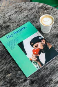
One notable aspect of design that often stands out in these awards is typography. In this article, we’ll explore how serif fonts evoke a sense of credibility and timelessness, focusing on how the Hey Barista magazine—an IDA award winner—blends tradition with modernity to create a strong impact through its typography.
Monotype’s 2024 trend report highlights the return of Serif fonts. After decades long defeat against sans serif typography, the classic typefaces are regaining popularity in the design world as more creatives seek a grounding and familiar visuals.
Serif fonts, characterized by their small lines or strokes attached to the ends of letters, are often associated with print media, formal documents, and historical texts. This connection to the past can subtly encourage the reader to approach the content with a sense of respect and gravitas.
Additionally, serif fonts tend to be legible and easy to read, which helps maintain the flow of the text, making it accessible while still conveying a sense of thoughtfulness. This combination of elegance and readability can invite the reader to immerse themselves in the nuanced ideas without distraction, while also subconsciously prompting them to take the subject matter more seriously.
When Serif fonts are used in modern and contemporary design, it can create a powerful contrast between tradition and modernity, giving the design a sense of credibility while still feeling relevant and fresh.
While serif fonts have long been associated with traditional printed word, their use in vibrant and youthful design serves several distinct purposes such as blending sophistication with approachability and relatability.
One design that exemplifies this blend of tradition and modernity is Hey Barista Magazine, where the typewriter typeface enhances the authenticity and approachable vibe of the coffee community.


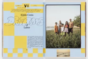
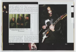
The design team describes their design as the following: “The coffee world is home to some of the most interesting people we know. Hey Barista is a print magazine to explore those people’s passions, musings, and more. The design of our second issue, which takes inspiration from workbooks, was crafted with the vibrancy of this community in mind, from intimate photography to hand-written title treatments and playful notations in the margins. Whether we’re getting dolled up with an Aussie barista/drag queen for a night out, or cycling the streets of Barcelona with delivery workers, our aim is always to do the creativity of the coffee community justice.”

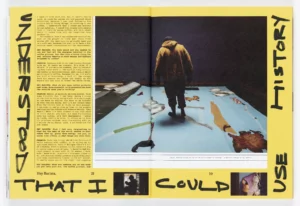
In a design that draws inspiration from workbooks and includes handwritten titles and playful margin notes, the typewriter font enhances the intimate, informal tone, making the magazine feel like a personal journal. It also offers a distinct contrast to modern design trends, blending tradition with contemporary energy to create a unique editorial voice that feels approachable and authentic.
In the case of this interview with Francis, the typewriter typeface likely reinforces the seriousness and depth of the conversation. The topic—engaging with the complex histories of coffee, colonialism, and identity—requires a tone that acknowledges the weight of these issues.

The typewriter typeface provides a visual grounding, suggesting that the ideas presented within the interview are part of a larger, enduring dialogue, one with deep roots in culture and history.
Ultimately, the choice of a serif font in this context creates a feeling of timelessness and weight, subtly guiding the reader into a reflective and contemplative state, preparing them to engage with the complex, layered themes of the interview in a more intellectual and respectful manner.
View the winning project here.
In modern and contemporary design, the use of serif fonts can introduce a layer of visual sophistication and historical depth, without making the design feel outdated or stiff. When used thoughtfully, serif fonts can communicate a sense of credibility and luxury while remaining adaptable to modern tastes. They can help designs feel timeless but still aligned with contemporary sensibilities, making them effective for projects ranging from branding and advertising to web design and editorial layouts. The result is a visual language that blends the past with the present, helping to create a nuanced emotional connection with the audience.
Ultimately, the thoughtful use of serif fonts allows designers to bridge the gap between history and modernity, creating an emotional resonance that connects with readers on a deeper level.