Harriet Tzou
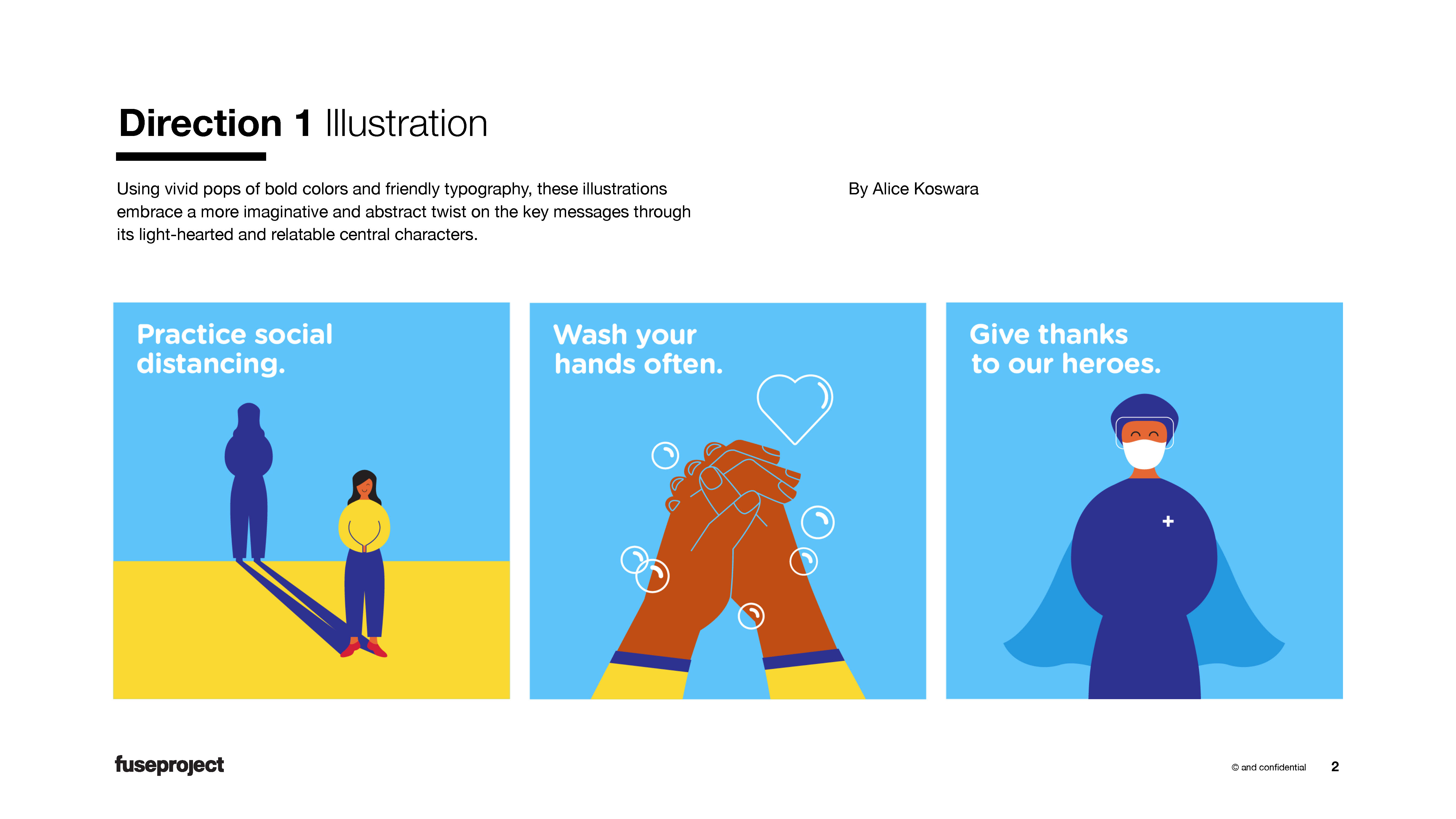
1. Clever Illustrations
by Alice Koswara
Using vivid pops of bold colors and friendly typography, these illustrations embrace a more imaginative and abstract twist on the key messages through its light-hearted and relatable central characters.
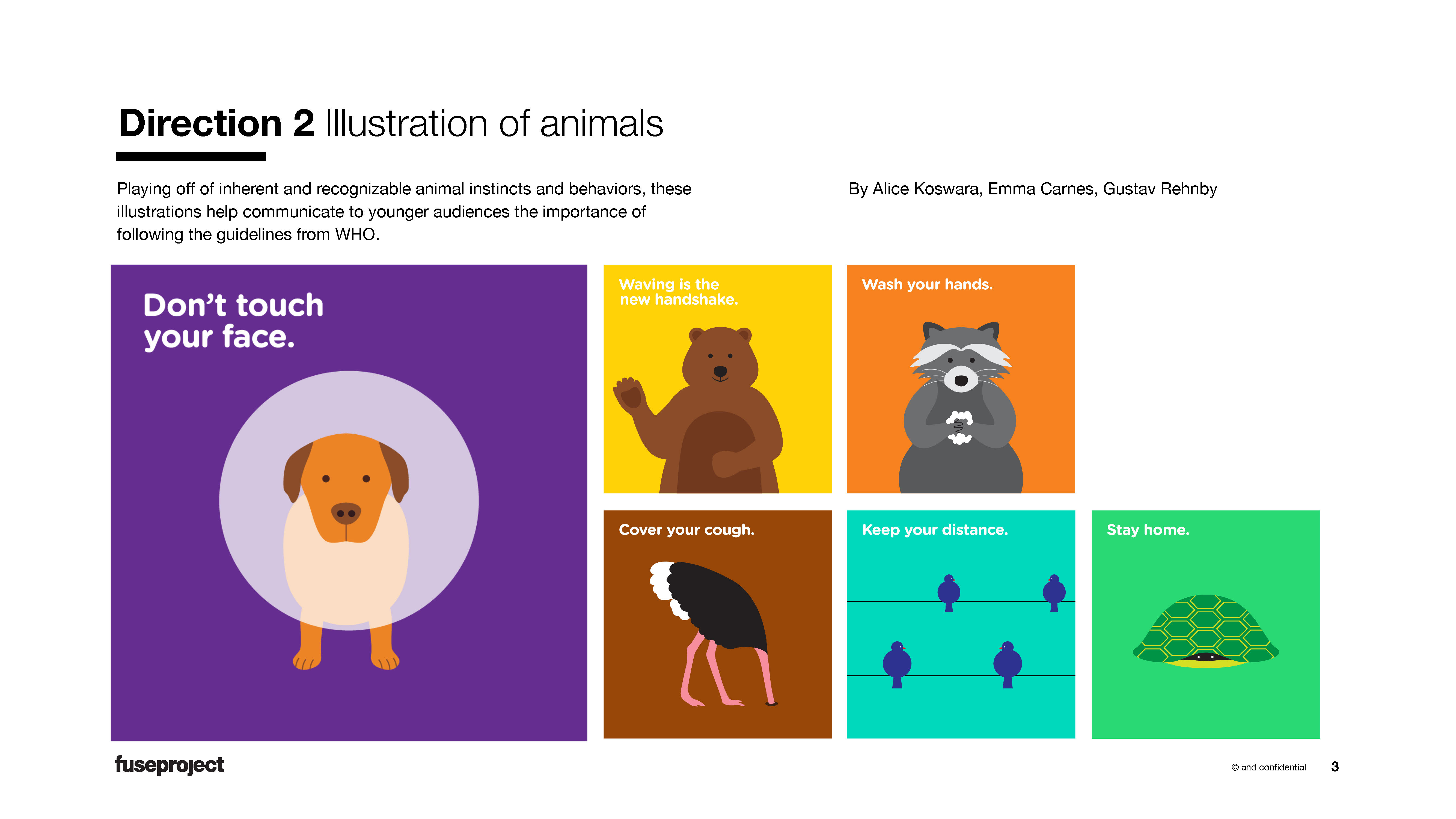
2. Animals
By Alice Koswara, Emma Carnes, Gustav Rehnby
Playing off of inherent and recognizable animal instincts and behaviors, these illustrations help communicate to younger audiences the importance of following the guidelines from WHO.
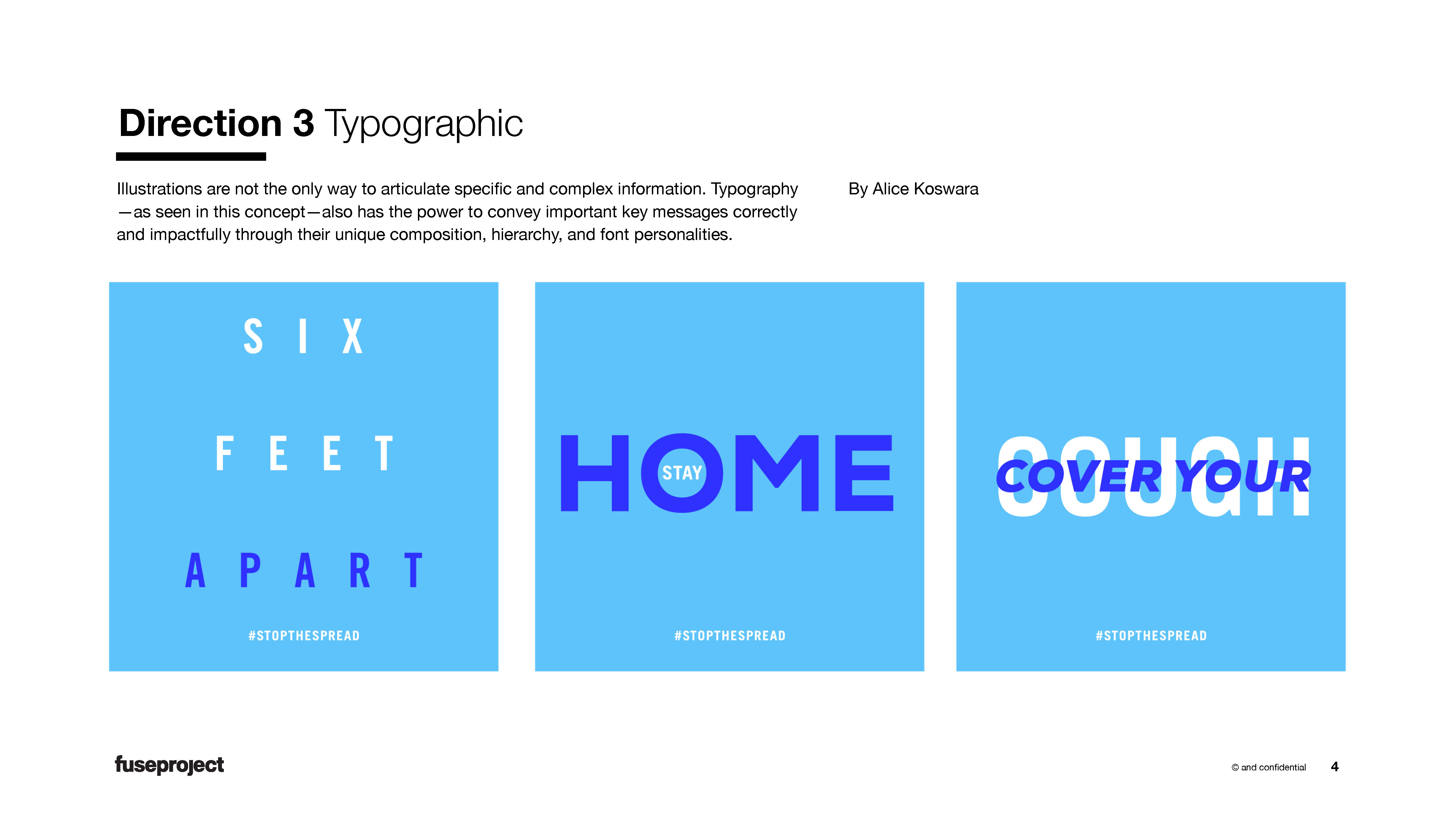
3. Typography Play
By Alice Koswara, Jayeeta Kundu
Typography?as seen in this concept?also has the power to convey important key messages correctly and impactfully through their unique composition, hierarchy, and font personalities.
4. Circle Highlights
By Gustav Rehnby
This straightforward and approachable campaign is both eye-catching and effective in its key messaging. The high contrast compositions are recognizable and suitable for a number of formats, including editorial, small scale print, social media, and large format.
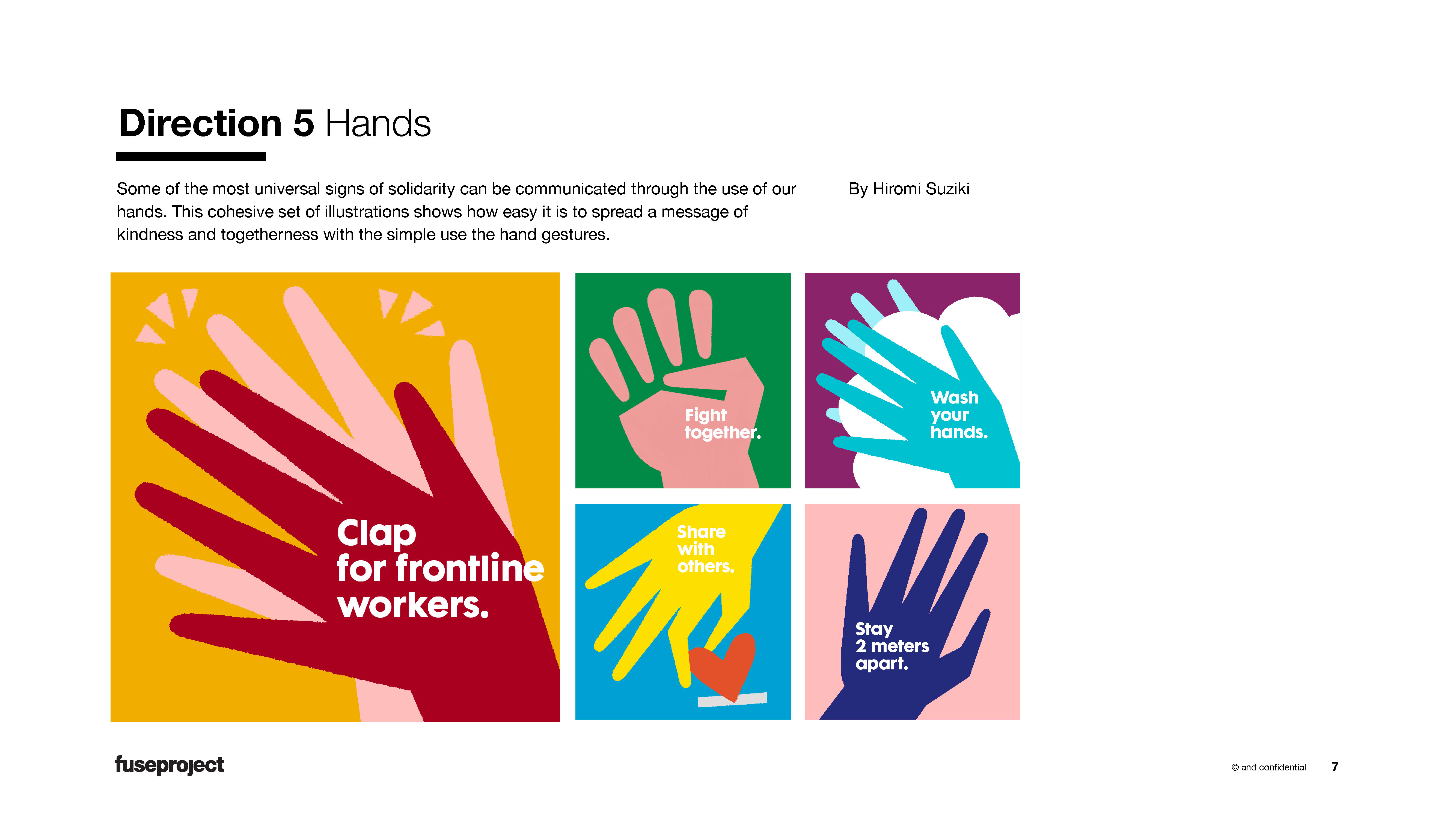
5. Hands Play
By Hiromi Suziki
Some of the most universal signs of solidarity can be communicated through the use of our hands. This cohesive set of illustrations shows how easy it is to spread a message of kindness and togetherness with the simple use the hand gestures.
6. Fill in the Blank
By All
This social media campaign aims to create solidarity across people sheltering in place and spreads a message of appreciation and thanks to everyone for doing their part.
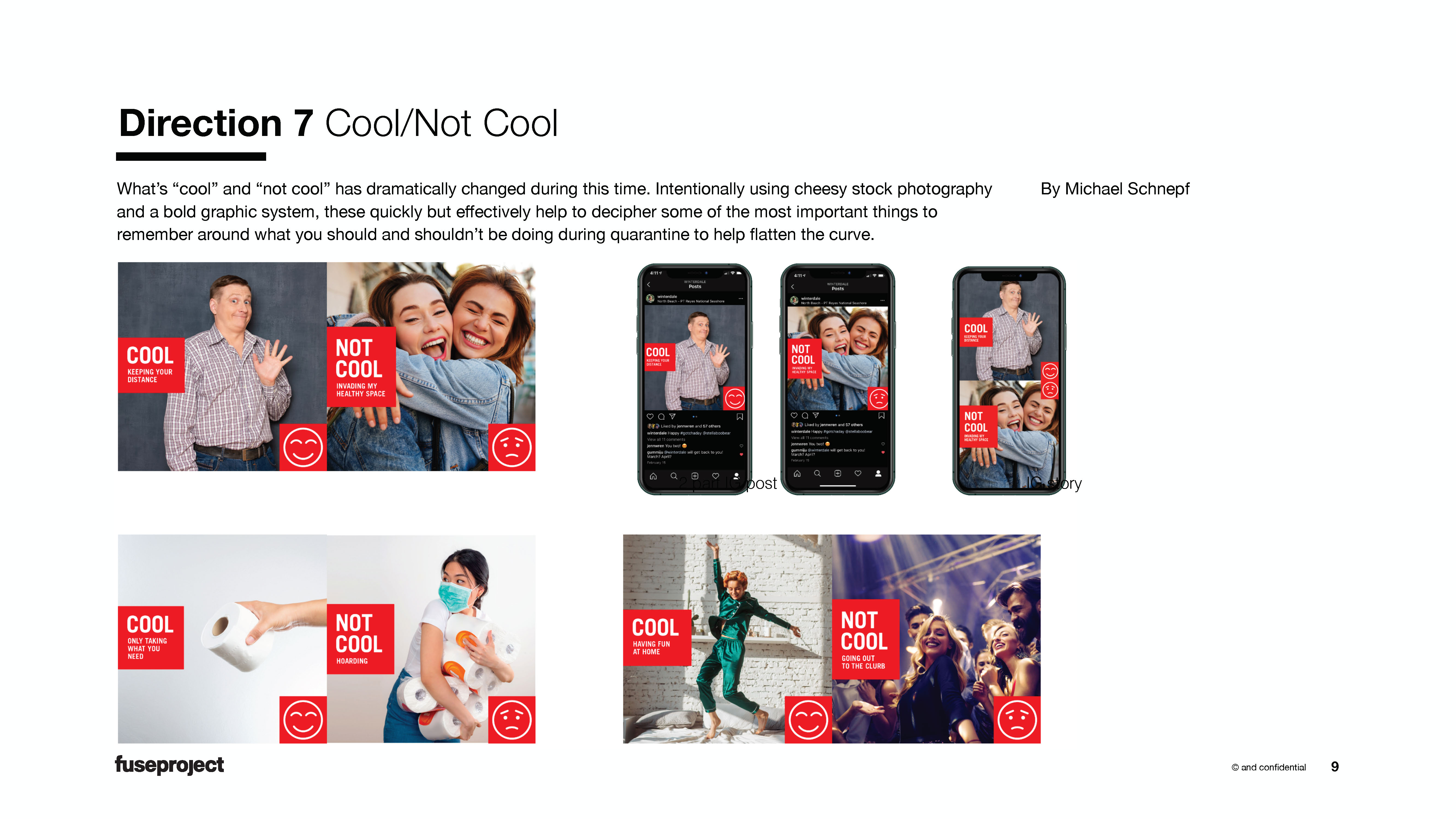
7. Cool/Not Cool
By Michael Schnepf
What?s ?cool? and ?not cool? has dramatically changed during this time. Intentionally using cheesy stock photography and a bold graphic system, these quickly but effectively help to decipher some of the most important things to remember around what you should and shouldn?t be doing during quarantine to help flatten the curve.
